Hey guys, today I’ll be going over doing anti-aliasing in pixel art.

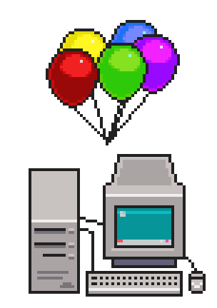
Left: not using anti-aliasing
Right: uses anti-aliasing
Anti-aliasing is a technique used in pixel art to help soften the contrast between two colors. This can be useful if the shades of two colors are a bit too harsh and you want to create a softer look to your pixel art.
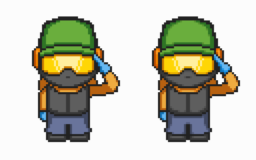
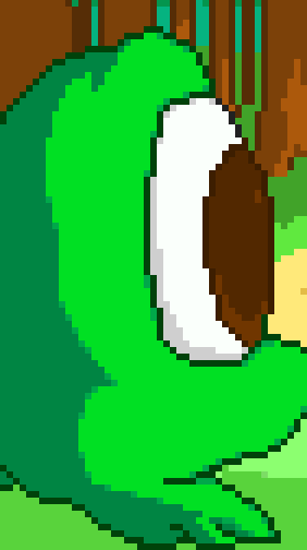
An example of anti-aliasing (right) in my most recent game Nameless
It’s actually pretty easy to do.
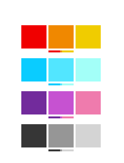
In this example, we find the “in-between” color which we would use for anti-aliasing. (which would be the middle color)
First we we have two colors to work with (based off of the example above), a simple one would be the red and yellow, so using our intuition we would use orange. The idea is to get the color that is in the middle of both colors in terms of:
- Hue (red,yellow,green,blue,violet etc)
- Saturation (how intense the color is)
- Lightness (how dark or light the color is)
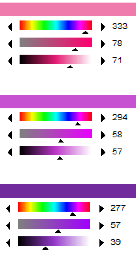
Using the previous pink/violet example, here I used Graphic Gale’s Hue,Saturation, Lightness Slider to find my middle tone.
Of course if you use RGB or HSV this can still work too!
Another trick is to create a new layer above your art piece, grab one of the colors, draw over the other color, then set the layer opacity to 50%, then just copy that new middle color.
So now that we have our middle color, how should we go about placing it?

While this technically isn’t wrong in terms of shading, it’s not really anti-aliasing.
The key is to place our mid-tone in a way that is subtle.

Getting closer, it does help with softening the two colors, but it’s not quite there yet.
I find the key to anti-aliasing is place the mid-tone pixels in corners, and to keep them spaced away from each other.

The mid-tone is placed in the corners sparingly (it doesn’t have to be in EACH and EVERY one). Notice too how it can even be placed on the flatter edges where it rounds off to help further add to the roundness of the shape.
Anti-aliasing can be fun, at least for me I find it to be a bit less formulaic, though tedious depending on your art piece. I find it works really well when there’s a lot of contrast between two colors.
Anti-aliasing in general looks good with rounder shapes, whereas if there’s a specific case where you want to emphasize the blockiness or sharpness of a shape, anti-aliasing may not be necessary.

Not only is anti-aliasing good for still maintaining contrast between two colors, but it provides another color for you to use in terms of shading.
Anti-aliasing works really well for large cartoon art styles
Anti-aliasing is completely optional depending on your preferences and art style. There are PLENTY of games that don’t even use anti-aliasing and still look good, it’s all just a matter of preference.
Happy pixeling!
-Brandon
www.tinywarriorgames.com