Hey guys, for the next few weeks I’ll be going over some of the things I’ve learned from doing pixel art for my games.
For this week I thought I’d first just go over the basics of using line-art if you were to go for a cartoon art style with your pixels.
To start things off lets show this example:
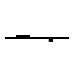
A simple example of a horizontal line being cleaned up
In general when you’re actually creating your art and go about cleanup, the general rule is to stick to 1 pixel thick lines and try to smooth things out.
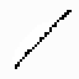
The rule here is still applied, 1 pixel thick lines and smooth things out.
This example above does not make a perfect diagonal line, but the rules still remain the same.
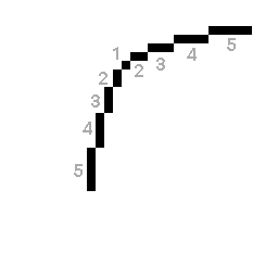
Gradual increase/decrease in pixels for curves
When you are doing curves, the rule to follow is to gradually increase/decrease the number of pixels in your line.
5 – 4 – 3 – 2 – 1 -2 -1 -1
I couldn’t help myself with this one, but here I just want to point out that curves sometimes revert a step back as they progress.
Notice how when it goes down to 1, it goes up to 2 then continues on. If you use the ellipse/circle tool in your pixel art program, drawing bigger circles will use this, so it’s good to keep this in mind when doing large curves.
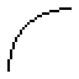
Sometimes curves won’t perfectly follow the curve count down/up rule.
Realistically, your art won’t always follow the count up/down rule perfectly. But you can still be consistent so that the line doesn’t look bent in some weird spots (unless you’re intentionally trying to doing that).
cleanup cleanup cleanup
One tip that I find helps is after you’ve done your rough pixeling and start doing line-art cleanup. If you’re confused where to remove pixels, try cleaning all of it up so that you mainly have 1 pixel lines, then if any lines look “off” (which may take a bit of a careful eye), just re-position the pixel to get the right shape. This is primarily one of the advantages that pixel art can have when it comes to making minor adjustments in your art.
Here are some more examples of line-art cleanup for some assets in Frog Hop
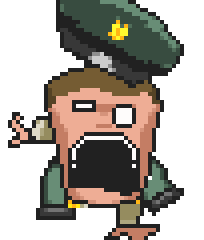
Owl Boss
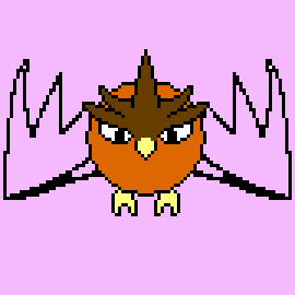
I animated one wing, then mirrored it.
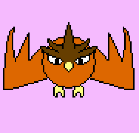
Cleaned up the lines, then added color
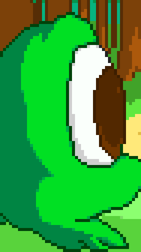
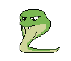
Cobra Boss – Venom Spit Animation

Roughed animation phase

Cleaned up lines, and also added in-between animation frames to smooth out the animation
Rawr
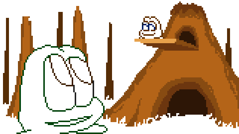
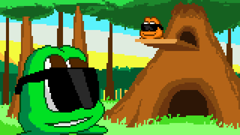
Cutscene Slide
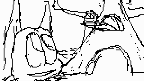
Conceptualized and roughed the cut-scene art
Line cleanup
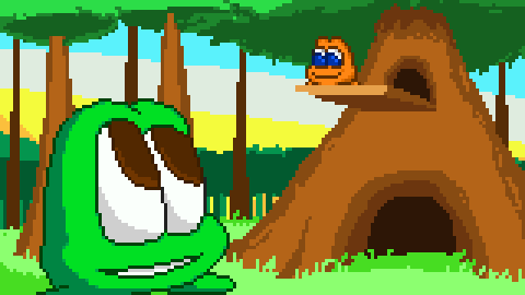
Colors, shading and background work.
Of course, at the end of the day it all depends on your art style for your game. Some games don’t even use the line-art approach at all! Some have a completely different approach simply because using line-art by itself may not match their particular vision, which is totally fine!
There are games that don’t follow these rules entirely but they still look visually appealing because they are CONSISTENT with the way the art is drawn and the overall presentation is not jarring.
Happy Pixeling!
Thanks for reading,
-Brandon