Game Development: Frog Hop’s Beginnings Part 3 (end)

Hi everyone, this will be the last of the Frog Hop’s beginnings series (perhaps I can always revisit some concepts in the future though). I mostly wanted to focus on how some concepts had to be scrapped in order to finish Frog Hop.
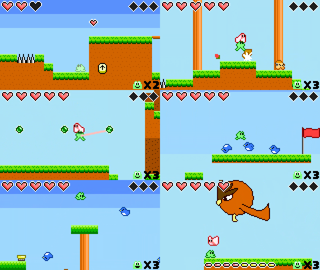
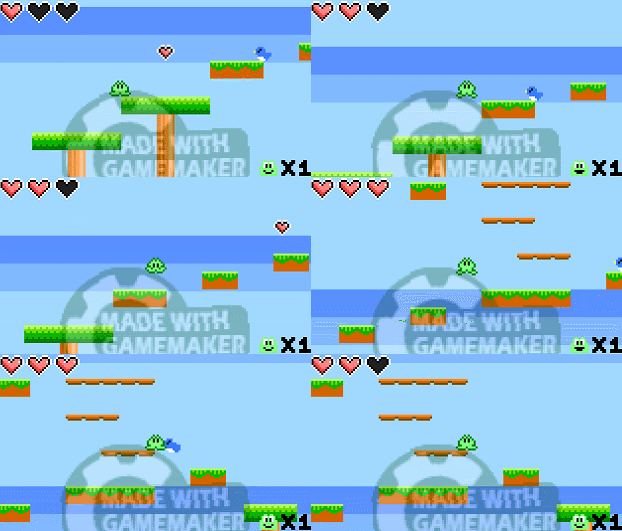
Frog Hop gameplay footage.

Frog Hop gameplay footage. A game that took a little over 4 years to complete.

Frog Hop, being my first big game had a lot of ideas that gradually accumulated in a design document. Of course, being one person, I simply can not develop all of these concepts.

You have to ask yourself if you’re even would be willing to be stuck with working on really boring, tedious stuff that players won’t notice for how long? 1 month? 3 months? 6 months? 1 year? 5 years? When you work on a game for a long time, you really don’t want to work on it for much longer. It’s important to know what sort of things you have completed beforehand (not just games but art or other projects) and how long they took you. If you don’t really have anything completed, you should try and really scale down your scope for your game.
You have to be honest with yourself

Do you lose motivation when you work on a project? You have to be honest with yourself when it comes to finishing a project and be willing to remove the ideas you love in order to reach the end.

Around the 2-3 year mark of Frog Hop’s development, I ran a Steam Greenlight for the game. While it was getting some eyes on it, the votes to get the game on steam were not doing well and the comments would at times be pretty negative. As a result, it was pretty hard to even be motivated to work on something that people wouldn’t care about. So what exactly got me motivated to finish this game? How did I manage to achieve some power that drove me to the finish line? Well…

I hadn’t really touched the game ever since I had put it up on Greenlight. But several months later, I received an automated email from Valve that Frog Hop got approved onto steam. I was pretty shocked, especially when people were not that interested in playing a simple pixel art platforming game.

While this was a great catalyst to have to drive me to work on the game, it still would not be enough for me to finish the game in its current state. I took a look at my design document for the game, looked at all of the ideas, and pretty much scrapped a lot of the concepts that I loved and streamlined the game down to its core design.
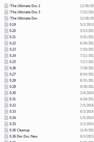
A lot of ideas and concepts accumulated overtime.

A lot of ideas and concepts accumulated overtime.

I can go for hours in detail on all of the stuff that got removed, but to help keep this somewhat enjoyable, I’ll go through a few design concepts that got scrapped and why I decided to remove some of them.

Scrapped Enemy Designs

Frog Hop has several enemies that are palette swaps (the same character sprite and art, but the colors are different) of each other, and have slightly different characteristics. There would have been even more of these palette swapped enemies and some other designs as well.
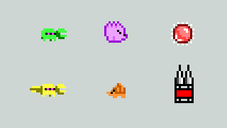
Just a few scrapped enemy concepts.

Just a few scrapped enemy concepts.

The biggest reason why they got removed was simply because there were already so many finished enemies and objects to work with and not enough levels to put them all in.

5 More Worlds

I can’t really remember what game inspired me to do this (I think it was Castlevania: Symphony of The Night), all I can remember was that when I was play-testing and reached the end of a level in my game, it was fun seeing if it was possible to go back to the beginning.
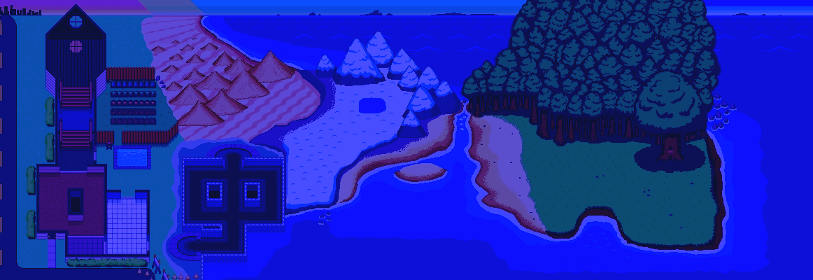
After you beat the game you would have had to go through the worlds in reverse and harder.

After you beat the game you would have had to go through the worlds in reverse and they would have been harder.

I’m pretty glad this was scrapped, as the game would have just dragged on for longer than it needed to.

Challenge Levels

There were going to be optional challenge levels. I imagined they would reward the player gems after completing a couple of them. More would unlock after you get further in the main game. Here are some sample level files that I had when I was working on the game.
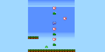
I believe to beat this one, you had to use your tongue attack to grab the butterflies.

I believe to beat this one, you had to use your tongue attack to swap for the butterfly companions to continually keep flying upwards.
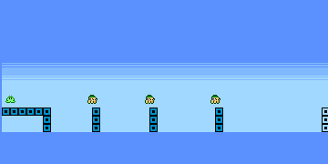
When you do your charge jump onto an enemy, that increased jump height carries over, and jumping on multiple enemies increases you jump height too

When you do your charge jump onto an enemy, that increased jump height carries over, and jumping on multiple enemies also increases your jump height.
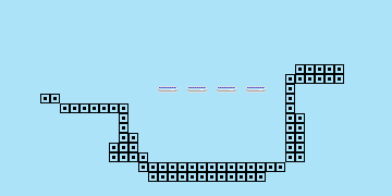
This one is kind of dumb, but the idea is that you avoid going into the center of the rings otherwise they shoot you down. So you would have had to awkwardly jump on the sides to get to the other side.

Here, you had to avoid going into the center of the rings otherwise they shoot you down. So you would have had to jump on the sides to get to the other side.
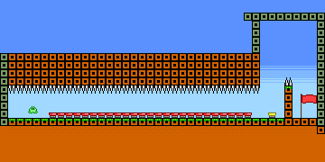
Pretty glad this got removed, the idea is that you can actually cancel the boost from a trampoline when you release the jump button, so you had to perfectly time the release input to avoid getting launched into the spike.

You can actually cancel the boost from a trampoline when you release the jump button, so you had to perfectly time the release input to avoid getting launched into the spikes.

I believe I scrapped them because I still hadn’t finished the main levels of the game. I loved the idea of having optional challenges, but I simply just could not diverge time into this aspect. Plus some of the challenges were really obscure and probably would have induced a lot of frustration. Even though they got removed, it was a lot of fun coming up with these level designs to showcase more in-depth mechanics of Frog Hop.

Some other bits and pieces

Some unused animation work, and other art pieces that didn’t make it.

Glorious unused frame by frame animation

Glorious unused frame by frame animation

As if the Octopus boss wasn't hard enough, there was going to be a hardmode version and he was going to be electric...

As if the Octopus boss wasn’t hard enough, there was going to be a hardmode version and he was going to be electric…
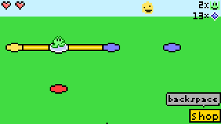
Old map concept, the movement was originally "on-rails" where you stay on the path.

Old map concept art, the movement was originally “on-rails” where you stay on the path.
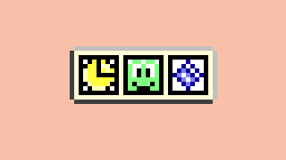
Accolades for each level, you would have gotten rewarded for beating it quickly, for not dying too much, and for collecting all gems.
Accolades for each level, you would have gotten rewarded for beating it quickly, for not dying too much, and for collecting all gems.

Unused roughed cut-scene art

Unused roughed cut-scene art

The beginning of a project is always fun, exciting and there is very little self-doubt. Just know that finishing a project is a whole different ball game, and generally involves spending a lot hours working on boring and tedious stuff that simply can’t be avoided. I’ve found that especially near the end of a project is where a lot of bugs start to pop up simply because the game is now in a bigger state and all sorts of different players that will run into problems that simply cannot be foreseen.

Anyways, that’s all I have for today regarding some of Frog Hop’s development.

Thanks for reading,

-Brandon


Game Development: Frog Hop’s Beginnings Part 2

Hi everyone, let’s go and continue on with some various stuff I thought I’d go over as I show how Frog Hop evolved in it’s earlier stages.

When I began work, I started on adding systems such as health and lives. Handling things like, does the player get launched when taking damage? Or making the UI face react to things such as pickups or death. Such decisions would have an indirect effect on the player’s gameplay.

The lives UI reacts to circumstances and the brief loss of control while invulnerability occurs when taking damage.

The lives UI reacts to circumstances and when you take damage a brief loss of control happens as well as invulnerability occurs.

Of course, there was exploration of other concepts that occurred as well, this was after-all an old school platformer…

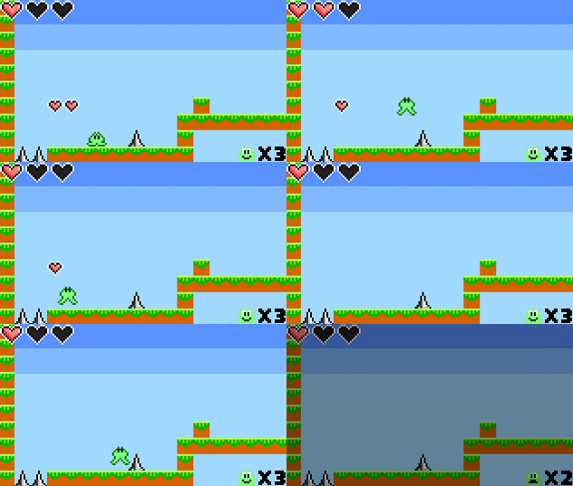
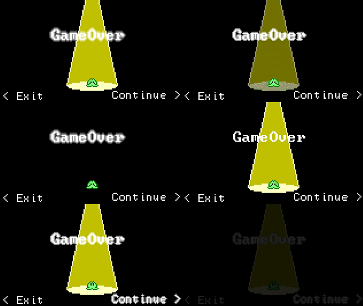
Yep, the game originally was going to have a game over screen. But it was kind of a dated concept and I wanted to make the game's transitions quick.

Yep, the game originally was going to have a game over screen. But it was kind of a dated concept and I wanted to make the game’s transitions quick.

The development continued, and I would go about adding some enemies…

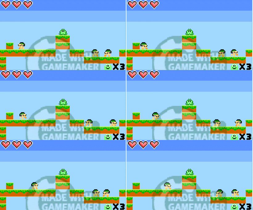
The first enemy in the game

The first enemy in the game

I started to think to myself, I need an enemy that tries to counter the player when they try jumping on them…

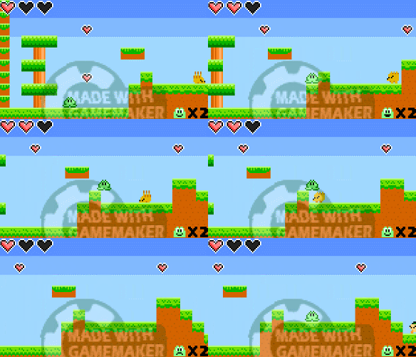
Alpha Hedgehog

Alpha Hedgehog

I’m not sure why I had the hedgehog damageable during it’s attack in the early version, Perhaps at the time I was thinking it would be less frustrating to at least kill during the attack?

The game needed an air enemy…

Funny thing is, the thought of copying Mario with winged turtles NEVER crossed my mind.

Funny thing is, the thought of copying Mario with winged turtles never crossed my mind.

Also notice how just pressing down on a thin platform sends you through it vs Holding down and pressing jump. This was done to avoid accidental fall-throughs.

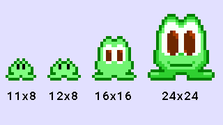
The enemies at the time did not have a colored line drawn around them. I think I was trying to stay true to my personal restriction of making the sprites 9×9.

But after giving it thought, the player sprite is actually 11×8 and I made a new rule to have the base sprite be 9×9, but then make it 11×11 to add a line stroke…

The line stroke was added to retain consistency (because the player had one but the enemies did not) and to help with visibility against the background

The line stroke was added to retain consistency (because the player had one but the enemies did not) and to help with visibility against the background

Speaking of which, the reason 9×9 was chosen vs a more common size like 16×16,24×24 or 32×32 was because I wanted to make a “simple game”…

An imagining if I had done the game at a higher resolution

A re-imagining if I had done the game at a higher resolution

The reason 9×9 was done (11×11 because of the stroke) was because 9×9 allowed more tiles to appear on screen within a widescreen resolution. 10×10 (12×8) was considered too but the Player sprite looked weird. Of course, back then my pixel art skills weren’t that great at the time so I went ahead and drew the player sprites at a higher resolution for fun. I’d be cool to animate a game at a higher resolution now…hmmm…if only games didn’t take so much work and time to make…

Okay, so now that we’re here, what was the point of showing these GIFs? Other than just seeing how the game changed and also retained some of it’s form, what is there to take from this?

After all it’s just a pixelated game that looks like a kid made it right? It should only take a week to finish the game…well…

Perhaps we’ll briefly delve into that in the next post, but as we all should know, the game took a little over 4 years to make.

If there’s anything to take from this, my biggest recommendation for anyone who is starting to make games or hasn’t finished any is:

  • If you’re just starting out, do game jams (Making a game in a short time frame). They force you to at least finish something and you will learn A LOT faster than just having some perfect pet project (frog hop) like I did and just tinkering and endlessly adding to it.
    • Regardless you will still learn, there was a lot of ways to code something that I discovered with Frog Hop, and I implemented what I learned into Nameless. And even after Nameless I still learned a lot to carry over to the next thing.
  • If you’re in the middle of a big project and you just want to be done with it quickly, put away that 200+ page design document and look at what you have so far. If anything looks salvageable, is there a way to cut it down so that the game can be simplified and still be a fun game?
    • This obviously depends on your circumstances and priorities though, with Nameless’ case, its Kickstarter nosedived really fast and as a result, A LOT of content was deleted in order to get it out the door fast before I started wasting more time than necessary.
  • Of course though, you can also not cut things out and trudge through to the end, fulfilling your Grand Vision. It’s not easy but it is possible. I can at least hope I’m living proof that even for big games like Frog Hop or Nameless, where the support was pretty meager, that you CAN finish big games (yes believe it or not there are people who finish stuff without the support from 1000+ followers on social media).

Thanks for reading, perhaps I will cap this short series off with one more episode before doing posts on other things. (Maybe it will continue another day)

To be concluded…

-Brandon

Game Development: Frog Hop’s Beginnings Part 1

Hi everyone, I’m back with another post on game development! Today I thought I’d share the oldest build of Frog Hop and run through the design decisions that took place. Obviously I won’t show EVERYTHING but I think the earlier Builds (A build is basically a version of a game) would be fun to talk about.

In the year 20XX, it all started in the magical land of Americana-…

When I had finished releasing my first game Rocket Launch. I wanted to make a new game but I had a handful of incomplete games that never got to see the light of day. (perhaps I’ll one day show these old games)

I had already created over 50 game design documents and had so many ideas. The excitement of being able to create worlds and fulfill my childhood dreams, it was great.

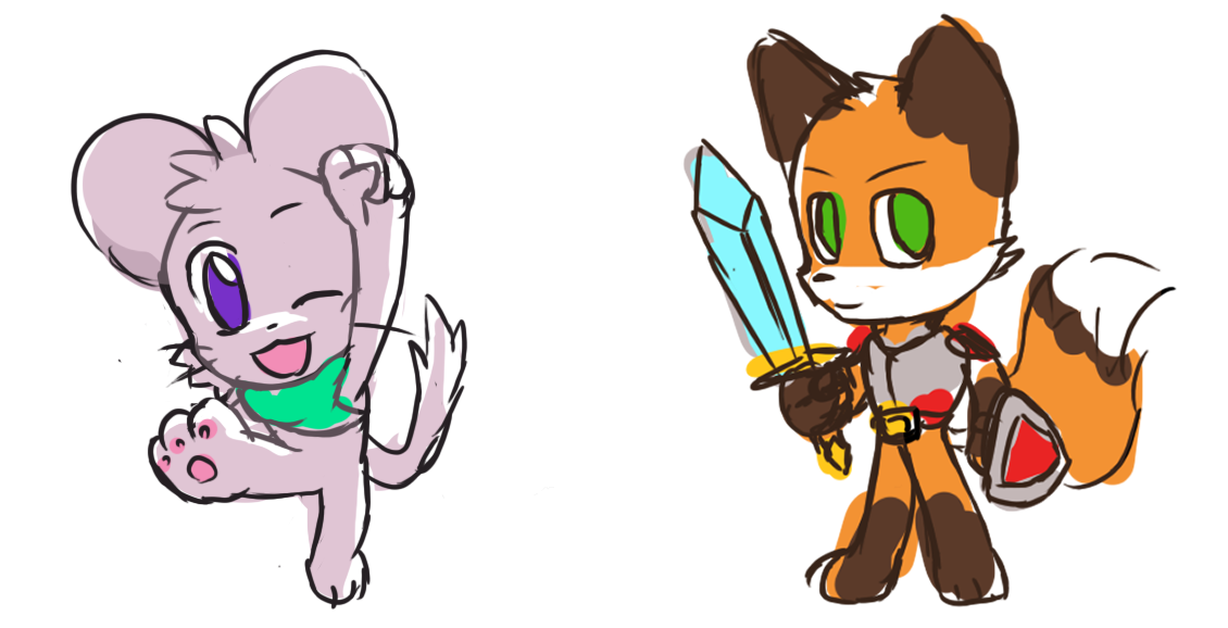
Reimagining of old characters I dreamed of making games of. Who are these characters you ask? YOU MAY NEVER KNOW MUHAHAHAH!

Re-imagining of some old characters I dreamed of making games of.

Of course, my skills at the time were simply underdeveloped. While I had attempted to undertake making the games of my dreams, it was too much work and I could only get as far as making a block jump around. If only I could make something super simple, like a game where you jump on stuff and hop around…like…a…

…!

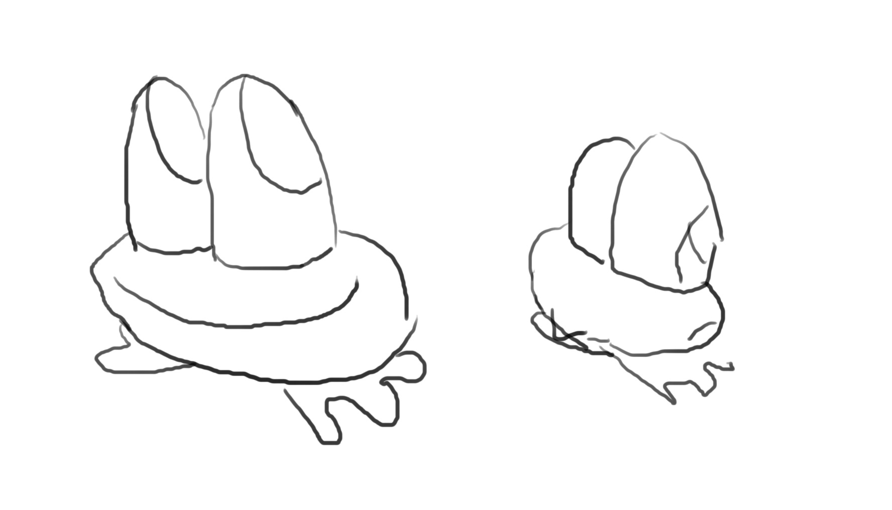
I took out a piece of paper and began drawing my newest game character. He had to look bold, heroic, tough, epic, detailed, lots of backstory, dynamic, complex, deep…

Deep character design

And so Hoppy was born, now let’s get to the actual game development.

I started with the basics, studying open source code, picking the stuff I liked in the code and incorporating it into my project, adjusting it as I went along.

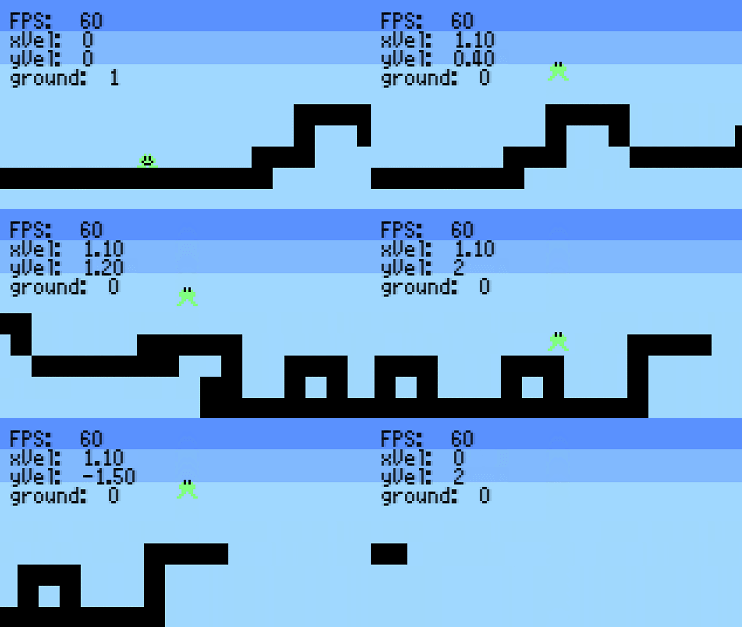
The first build of Frog Hop

The first build of Frog Hop

Some things to point out from the build, the intent and why they changed:

  • You could not walk on the ground. I wanted to emphasize the jump to move, but it got changed to walking since you could carefully adjust your position before a jump and still helped emphasize that you’re playing as a frog.
  • The jump was originally an auto-hop. I think I was playing games like Quake at the time which featured an auto-hop. My intent was that the jump should feel effortless and not tedious, which was originally why it was there. As a result of that however, players got more bored with the auto-hop since you could just hold it down and hold right and recklessly bypass half the level. Thus the auto-hop was removed.
  • You had full-on air control. If you wanted to changed directions on a dime you could. At the time I think it was mostly a coding thing and so I never got to tweaking the air physics quite yet. As I worked on Frog Hop more, the air control became “floatier” but you can still easily influence your air movement.
  • The character always faced towards the screen. At the time I wanted to go for a simple charming game (like Atari) with unique quirks to it. One being that the character did not face left or right. This actually stayed this way for quite a while because the tongue ability had not yet been utilized.
  • Hoppy had a smile. Something simple like this actually proved to be a problem. One thing that made this game challenging to work on was that the sprites had to be within a 9×9 sprite size limit (technically 11×11 because of the stroke effect). Because of this limitation, the mouth section was removed because the face of the character was hard to read.

Believe it or not, Frog Hop was just going to have 3-5 levels and a boss and that would have been it. Of course if you look at my previous post you can see one of the reasons why it started to grow out of control.

To be continued…

-Brandon