Howdy folks, Sheriff Woody here from Toy Story 7: The Electric Boogaloo here to talk to you guys about mockup art and why it’s so gosh darn, rootin’ tootin’ important for game development.
…
“Toy story is good.” -GabeN
…
So anyways, this will be a fairly hefty post, but there will be plenty of visual material to look at.
Mockup art is still or animated material that attempts to communicate the “final look” of a product which can help a team cohere with an idea (sort of like a visual model that gives the impression that we’re “playing” it). Mockup art is in some ways like concept art, though concept art is more about the raw bare bones rapid idea building for things like character designs, environments, User Interface, effects, gameplay mechanics and so on.
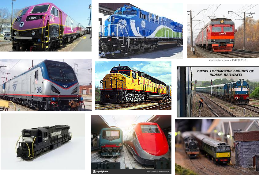
Of course Mood Boards are also a form of conceptualization, they are in someways the precursor to the concept art phase, where the director tries to give the concept artist an idea of what they want something to look/feel like. Below is an example of a Mood Board:

In this made up mood board example, let’s say we want to have our concept artist design a somewhat realistic and modern looking train for some epic escape sequence in our game. This is to some degree what we probably would hand over to them.
As you can see above, the train example is simply our attempt at giving an artist a feeling of what we want and that they can tinker with these images to create some kind of conceptual art piece.
Concept art afterwards takes these elements to create an idea that we can get a feel for.
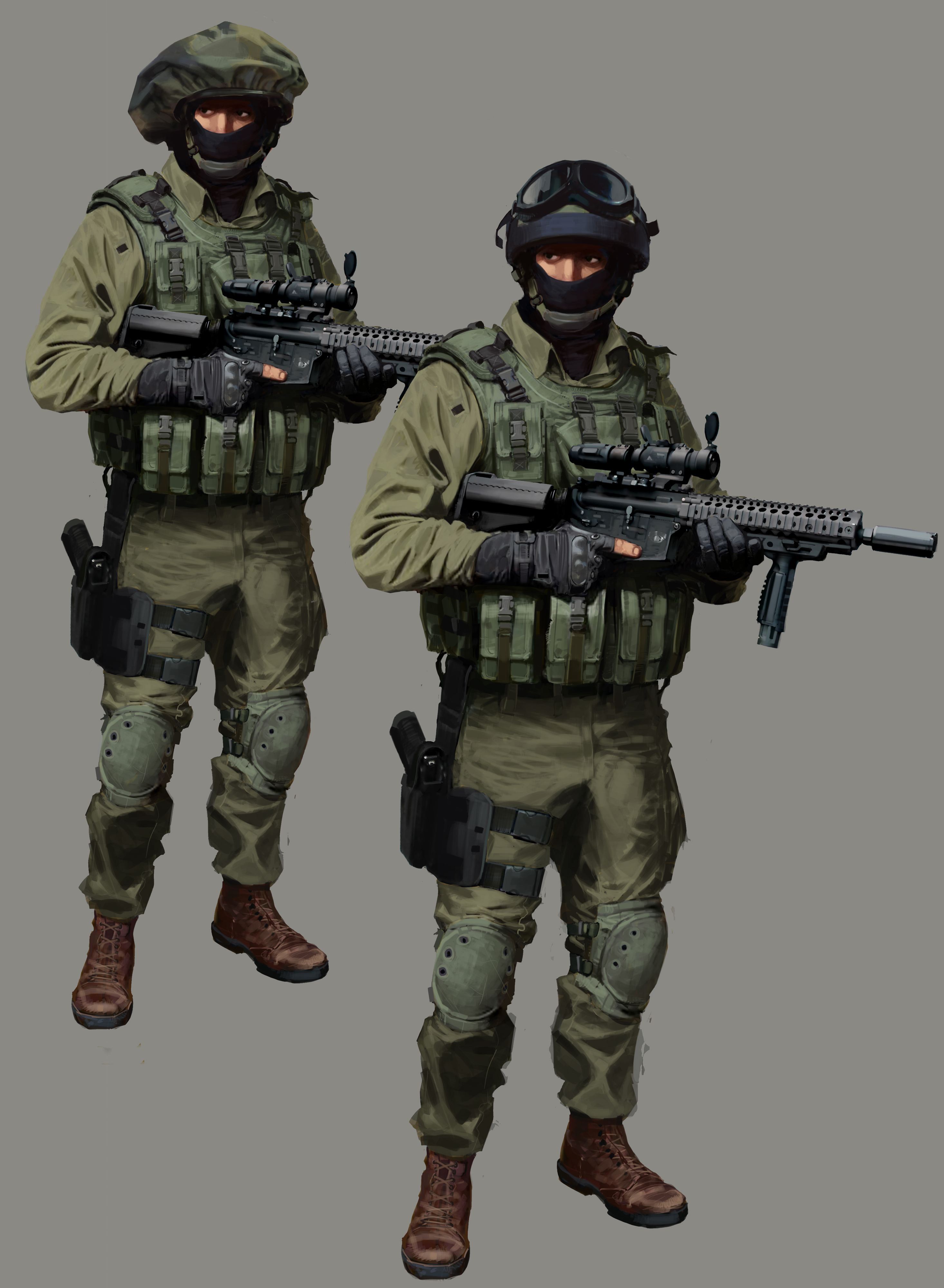
Clearly we would turn a train moodboard into this…

This is concept art from Counter Strike Global Offensive. while yes concept art can be made to look pretty, the true purpose is to quickly meld ideas that look *just* good enough for the director to decide.
And generally this process of concept art is very loose and continual until something coheres.
But now, let’s get on with talking about mock ups and why they’re so boss…
(prepare for less impressive artwork compared to above!)
So with Mockups they are a conceptual tool that gives us a feeling of the kind of game we are making and what it might play like.
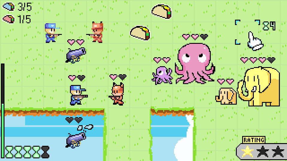
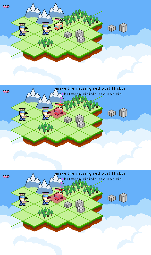
Below you can see the very first conceptual mockup of a game I made in collaboration with Jolly Crouton Media called Franchise Wars.

In this very first mockup for the game Franchise Wars. While almost none of this made it into the final game, you can still see ideas of the HUD and cursor, the feeling it might give from a gameplay standpoint (and maybe even audio)
So even though this example did not at all represent the final product, it still communicated the idea of a turn based strategy game.
Actually I think the idea of that one was sort of an aggressive strategy game where you collect more tacos than the enemy team and…uh, yeah i dunno there’s some random stuff going on.
I mentioned earlier that mockups can be animated, and it’s true!

Franchise Wars attack mockup example
You can see though that these did not result in the final game, but you’ll see ideas being played around with visually to help programmers implement said features.
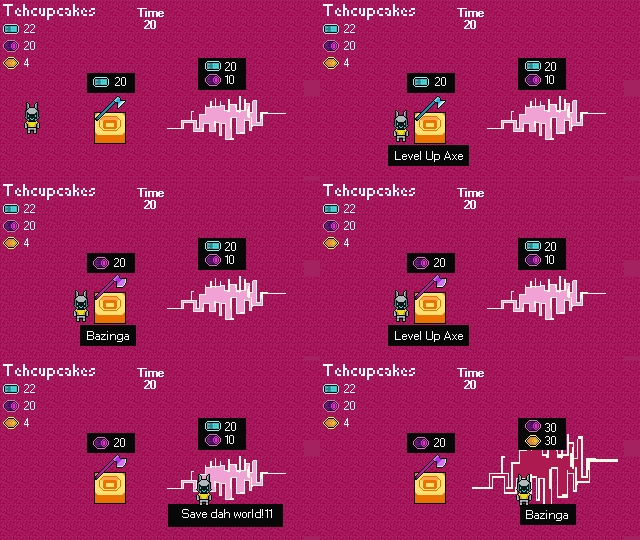
Actually in a game that a friend and I made for the Global Game Jam 2020 called Trapped in Time, I made an animated mockup for him below:

Trapped in Time upgrade interraction mockup
This mockup’s goal was to give the programmer an idea of how to design the UI interface for our resources as well as the interactive workbenches in game.
So while you don’t have to make mockups super fancy, you can still be very specific with certain designs of things to make it easier for your programmers to figure out how they will code the system you need by doing this. Mockups are simply amazing when words are just not enough to communicate the feeling or visual look of an idea.
It might seem like social media promotional material, but it’s really meant to help keep everyone on the same page. Because try imaging how this interface would have turned out had I not made this example for the coder.
It would be like me trying to explain to you that we’re going to make a frantic cooking game, and the kitchen shelf will be along the northern wall, and there will be a ui on the screen that shows your orders and your guy can hold items, and there’s a microwave and the walls will make the shape of a ‘U’.
…
While an abstract idea might be formed from this, it’s just not specific enough to help other people really understand what I just spewed out in the previous paragraph. And even if I was more detailed in my explanation, it would only make other people’s heads spin…so…
…
How about we…
…
Make this better…
…

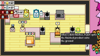
UI and interaction mockup for Day of the Dad
Much better…
This example is from the Global Game Jam 2019 game, Day of the Dad.
As you can see, instantly this example gives us a feeling of how the UI might operate, the mechanics of the cooking ware, the UI above said cooking ware, how the Meters work, the end goal with the kiddos. It’s all accomplished in just a single image.
After all they do say that “a picture is worth a thousand words.” – Gabe New L
So yeah, I think you get the idea, mockups rock, use them if you are an artist/designer and you are in a team environment. They help reduce future frustration because no one likes to work on something for hours only to have it get thrown out. This definitely can help reduce that, though at the end of the day, mockups are a communication tool, an effective one at best especially for artistic projects.
For the rest of the post, I’ll just kind of spew out other old concept/mockup images I’ve made.

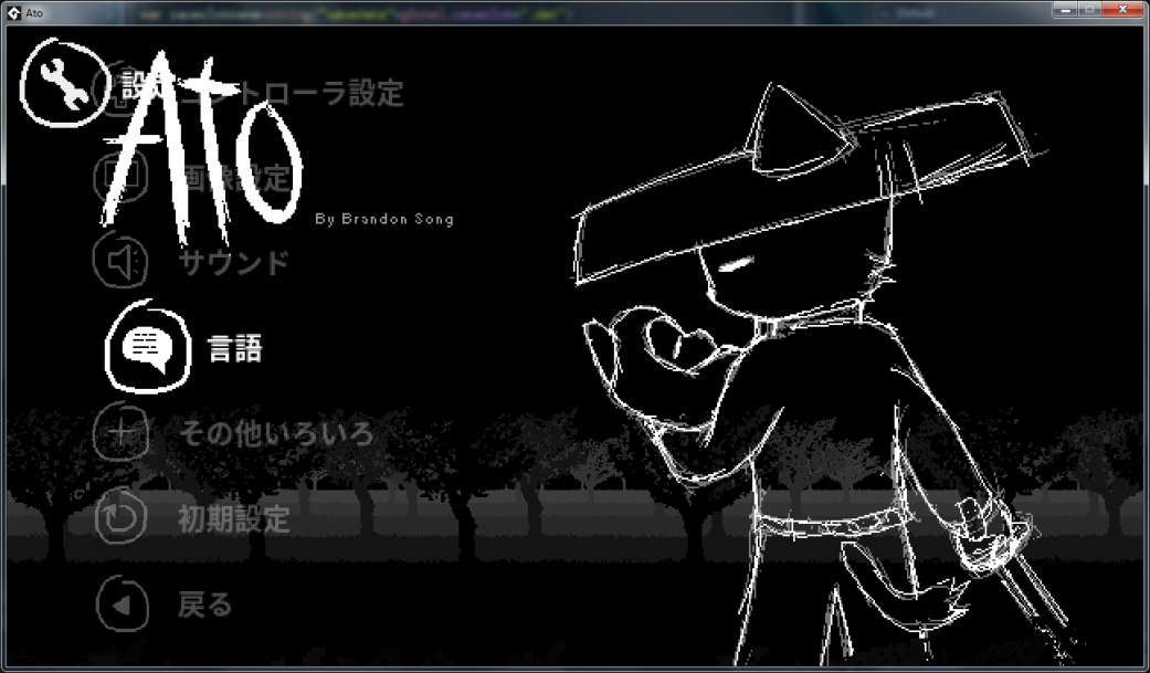
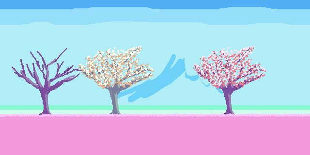
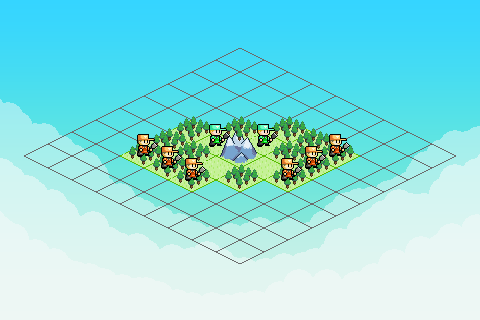
From the game, Ato.
The above example is from my current project called Ato. An atmospheric sword dueling game. The example was a test for visual color usage before I really committed to the look.

Level design concept, which actually I made a good number of these for myself visually because the tools to design levels were a bit lacking. So having created these helps me get a better feel for the level design. (because again the tool to create the levels was purely data entry, that’s right, no real-time visual feedback, just numbers and words to plug into a gray chart)

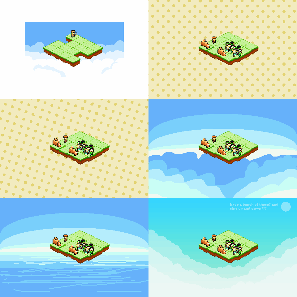
background designs

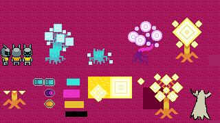
object spew, not really meant for sharing but when I work I like to have a canvas image file to work off of for comparing sprites all in one image.

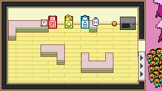
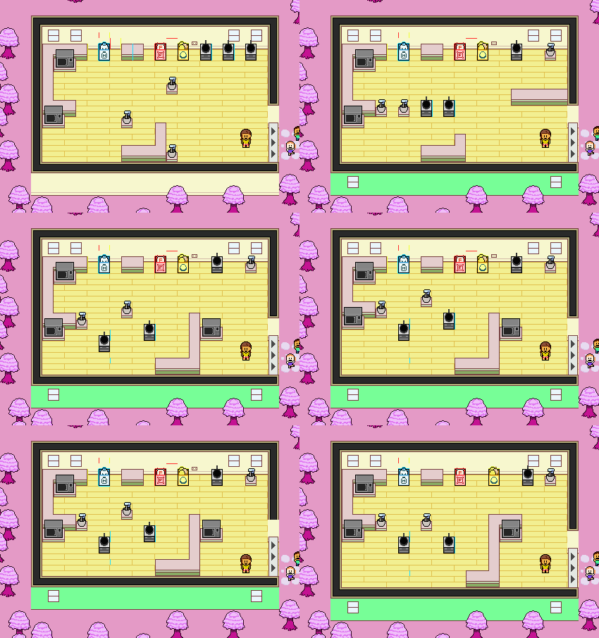
The first conceptual image I made for Day of the Dad. (I think that thing at the top right by the microwave was a ramen cup?)

When I made Day of the Dad with the fine fellows of Cincinnati, I did not have Unity, so I literally designed the level in pixel art so one of the programmers could actually have something to go off of.
I think my approach with the level was to make it just varied enough and provide strategy. The idea was you that had very few but super close cooking ware options near the doorway. But to clear out larger amounts of orders, the bulk of the cooking happens on the back end so you have to plan ahead your mass cooking/delivery approach when you clear orders out. The microwave closest to the door was intended as a desperation, while the back 2 are also desperation, but mostly I think it was the same idea of mass cooking, however to effectively utilize them is tricky and requires some degree of setup. All in all it was quite challenging trying to make a “good” and varied single level for the game. (Of course, if we did have more time (since we only had 48 hours), there probably would be more level layout types)

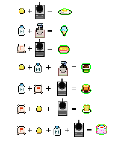
Day of the Dad RECIPE CHART MEANT FOR NINTENDO POWER STRATEGY GUIDES.
Believe it or not, this recipe chart was incredibly invaluable to the programmers. References like these are logical and easy for them to understand and process.
So that’s about all I got, like I said this post was pretty hefty, but I hope you found it interesting/helpful.
Thanks for reading!
-Brandon
